portfolio
Portfolio
Visualising Twitter's Shadows
This project is about using sentiment analysis and Blender, a 3d modelling program, to visualise the negativity of Twitter. The goal is to excavate society’s shadows through social media. What does that mean? Well, following Carl Jung’s idea of the Shadow, I use “shadows” to refer to the sides of ourselves that we’re unaware of more often than not, the sides we refuse to accept because we judge them as negative or “bad”. This concept can also be applied collectively, and in this project I try to give a face to this collective shadow, the dark sides of society.
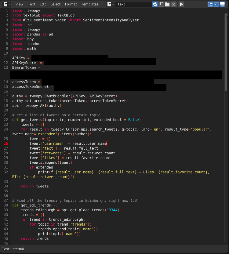
To do so, I learned to access the Twitter API and wrote a script to obtain the current top 50 trending topics in my local area, the city of Edinburgh, and find 10 popular tweets in each of these topics.
The script then performs sentiment analysis on these tweets to obtain negativity and positivity scores, and aggregates other data about them, like retweets, likes, length, etc., and builds 500 cubes in Blender, each of which has properties tied to the attributes of the corresponding tweet: size according to popularity, colour according to negativity, etc.
This can then be rendered into an image, an animation or even a VR scene to make the visualisation more impactful.
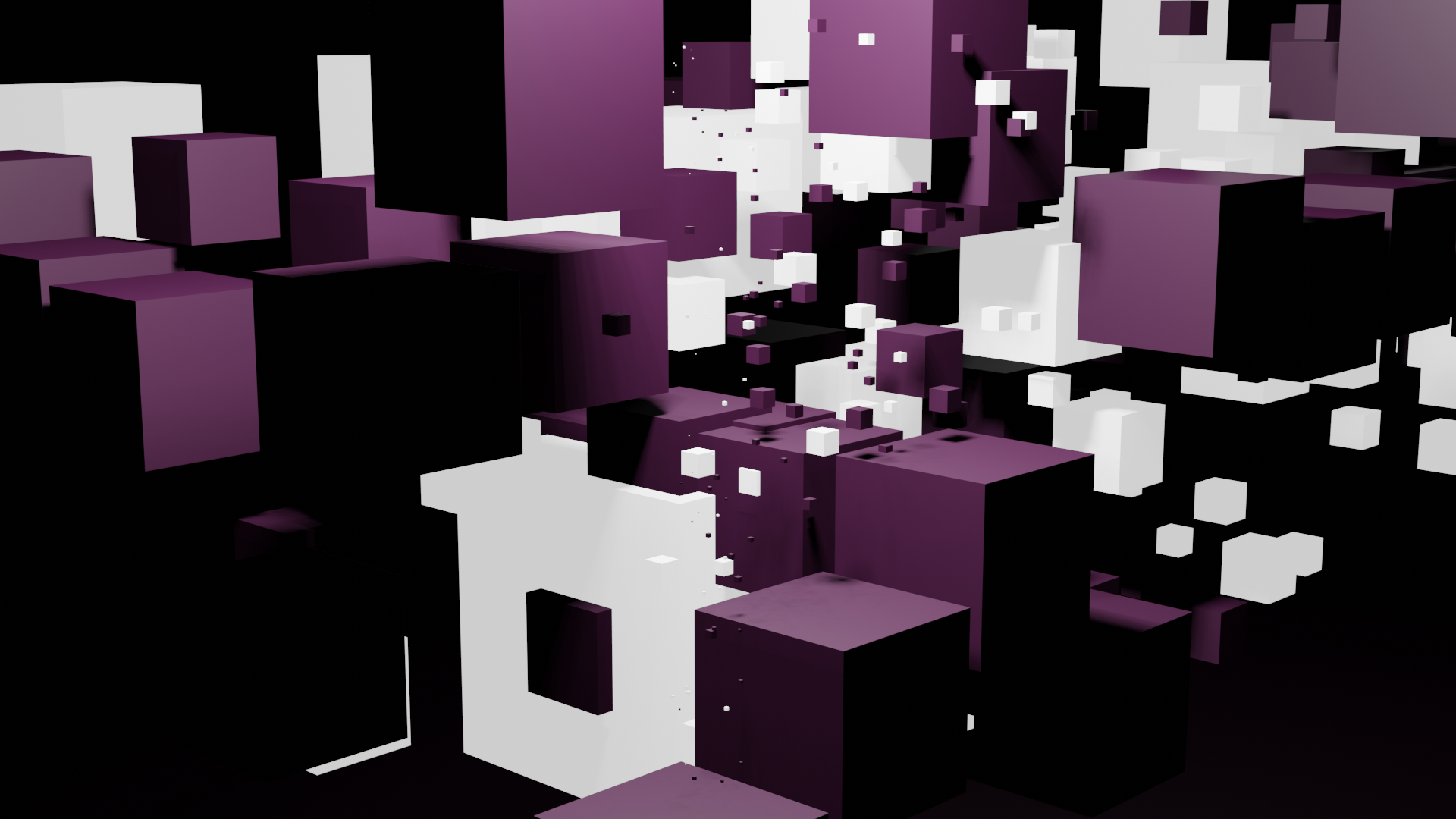
Here, each cube represents a tweet. White, luminous cubes are tweets classified as positive by the VADER algorithm, while purple cubes are the ones classified as negative – the shadows that are the focus of this project.
The size of each cube is proportional to its popularity: number of retweets + number of likes.
I really liked doing this project because it allowed me to use together very different skills I had obtained in varied contexts in a new way. Mainly, I was able to take advantage of my coding skills in a new way: as a medium to produce a provocative piece, rather than just as a way of showcasing my work or a tool to solve analytical problems. Furthermore, it allowed me to learn three things that I was interested in: using the Twitter API, applying sentiment analysis, and visualising data in 3D environments using code.
Career Bridge
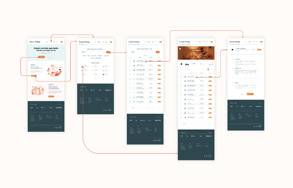
Career Bridge was a design service project to help young mothers to take care of their kids. We tried to reduce job discrimination by making it easy for companies to offer longer parental leaves to both fathers and mothers. Since our main resource was university students, for research and to help mothers, we ended up designing a service where students would be able to get internships in companies to cover for parents while they got their parental leave.
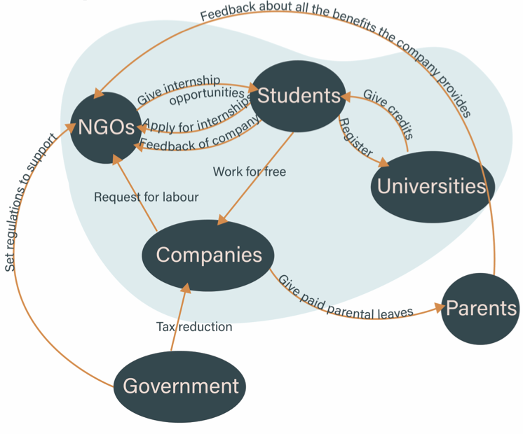
Admittedly, this service runs on a couple of assumptions that might not be true, like that enough students would be willing to volunteer in this way, or that they have enough skills to actually take over parents’ jobs in meaningful way. Furthermore, it could have negative consequences, since if companies find they can hire younger people that can do the same things parents can do at a lower salary, then they might end up firing the same people we were intending to help.
However, I’m proud of this project, because it was my first service design project, and it was the first time I worked closely in a team with people from cultures very different to my own. It took a lot of effort to learn to communicate and work with them, but I think I learned a lot about teamwork and project management thanks to it. Furthermore, it was my first time using co-design and interviews as design research methods, and I was amazed by how useful these methods could be, specially co-design which was so similar to the workshops I did in Public Speaking.
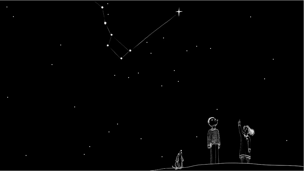
Save the Stars
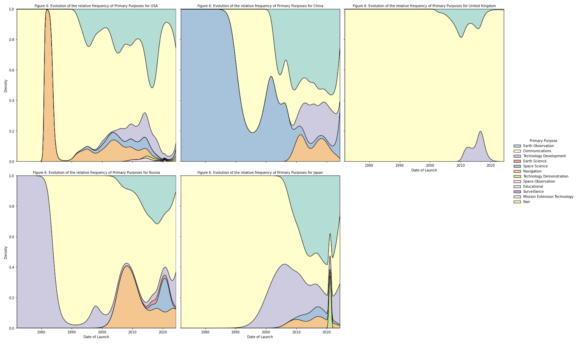
It started as a data visualisation project, and while I did perform an analysis and visualisation of the dataset in Python on my own, it ended up becoming an undertaking in storytelling. As a team, we were missing the skills and the time to produce a meaningful interactive visualisation with a dataset as complex as the one we had – a registry of 1900 satellites launched since 1975 with 17 different attributes. Therefore, we decided to go to the core of the message our professor had given us along with the dataset: a worry that someday we might not be able to see the stars in the sky.
I’m personally very proud of this project because of its provocative nature. It uses a small amount of elements, but it’s able to leave the user with a very distinct and intense feeling of nostalgia for the present and a worry of what the future might look like. Personally, I was responsible for transforming the animation my teammates made into a website that would play as the user scrolls down, and I also came up with the idea of adding some lines of poetry, which I wrote myself.